CSS Grid 是二维布局方法,也就是用竖线和横线将内容划分成格子,像棋盘一样。本文只介绍常见用法,要了解全部用法请看 MDN Web Docs 。推荐大家看完后做文末提到的习题。
概念 #
网格容器(Grid Container)、网格项(Grid Item) #
display: grid | inline-grid 使元素变成网格容器,其子元素叫网格项(其他后代不算),按照网格布局排列。下面代码的 .container 是网格容器,.item 是网格项,.sub-item 不是网格项。
1
2
3
. container {
display : grid ;
}
1
2
3
4
5
6
7
< div class = "container" >
< div class = "item" ></ div >
< div class = "item" >
< p class = "sub-item" ></ p >
</ div >
< div class = "item" ></ div >
</ div >
网格线(Grid Line) #
划分网格的竖线(vertical line)或横线(horizontal line)。横线方向和书写方向一致(英文是从左到右),竖线方向是从上到下。同一条网格线可以有多个名称。
虚线是网格线
网格单元(Grid Cell) #
网格布局的最小单位,就像电子表格的单元格和棋盘的格子,相邻的 2 个竖线之间和相邻的 2 条横线之间的区域。1 个网格项可以使用多个网格单元。
网格轨道(Grid Track) #
2 条相邻网格线之间的区域,也就是 1 个横排(row)或者 1 个竖排(column)。
网格区域(Grid Area) #
由 4 条网格线划分的区域,也就是长方形,比如 1 个网格单位、4 个网格单位、6 个网格单位。
示例(A 表示网格区域):
显性网格(Explicit Grid)、隐性网格(Implicit Grid) #
显性网格有固定数量的网格轨道,比如 3×3。如果此时加入额外的网格项,网格将自动添加 auto 尺寸的隐性网格轨道,原来的显性网格轨道加上自动添加的隐性网格轨道就是隐性轨道。只定义竖网格线也可以产生隐性网格。
fr(fraction)1 份可用空间 #
fr 表示网格容器的 1 份可用空间。
1
2
3
4
5
6
7
. container {
display : grid ;
/* 3 个竖排,比例为 1:2:1 */
grid-template-columns : 1 fr 2 fr 1 fr ;
/* 3 个横排,第 1 横排为 30px,剩余横排比例为 1:1 */
grid-template-rows : 30 px 1 fr 1 fr ;
}
minmax() 最大最小值 #
参考资料:minmax() - CSS: Cascading Style Sheets | MDN
minmax() 函数设置最小值和最大值。下面代码表示第 1 横排的尺寸最小 50px,最大 auto(根据内容自动扩大)。
1
2
3
. container {
grid-template-rows : minmax ( 50 px , auto ) 1 fr 1 fr ;
}
repeat() 函数 #
参考资料:repeat() - CSS: Cascading Style Sheets | MDN
repeat() 函数用于表示重复的网格轨道片段。
在线示例
1
2
3
. container {
grid-template-rows : repeat ( 3 , 1 fr ); /* 1fr 1fr 1fr */
}
在线示例
1
2
3
. container {
grid-template-rows : 2 fr repeat ( 2 , 1 fr ); /* 2fr 1fr 1fr */
}
除了使用固定的数字,还可用 auto-fit 和 auto-fill。
网格容器的属性 #
网格容器可以使用以下属性。
display
grid-template-columns
grid-template-rows
grid-template-areas
grid-template
grid-column-gap
grid-row-gap
grid-gap
justify-items
align-items
place-items
justify-content
align-content
place-content
grid-auto-columns
grid-auto-rows
grid-auto-flow
grid
display 设置容器 #
对元素使用,使其变成网格容器。
1
2
3
. container {
display : grid | inline - grid ;
}
值:
grid:生成 block 级网格容器
inline-grid:生成 inline 级网格容器
grid-template-columns、grid-template-rows,网格线名称与网格轨道 #
参考资料:
示例(在线版 ):
1
2
3
4
5
6
7
8
9
10
11
< div class = "container" >
< div class = "item item1" > 1</ div >
< div class = "item item2" > 2</ div >
< div class = "item item3" > 3</ div >
< div class = "item item4" > 4</ div >
< div class = "item item5" > 5</ div >
< div class = "item item6" > 6</ div >
< div class = "item item7" > 7</ div >
< div class = "item item8" > 8</ div >
< div class = "item item9" > 9</ div >
</ div >
1
2
3
4
5
6
7
8
9
. container {
border : 1 px solid red ;
height : 400 px ;
display : grid ;
/* 3 个竖排,比例为 1:2:1 */
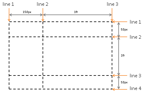
grid-template-columns : 1 fr 2 fr 1 fr ;
/* 3 个横排,第 1 横排为 30px,剩余横排比例为 1:1 */
grid-template-rows : 30 px 1 fr 1 fr ;
}
现在网格项排列成这样:
可以用 [] 定义网格线名称,用空格分隔多个名称。
1
2
3
. container {
grid-template-columns : [ column1-start ] 1 fr [ column2-start ] 2 fr [ column3-start ] 1 fr [ column - end another-name ];
}
grid-column-start 和 grid-row-start 可以改变网格项的位置,在线示例 。
1
2
3
4
5
6
7
8
9
10
. container {
display : grid ;
grid-template-columns : [ column1-start ] 1 fr [ column2-start ] 2 fr [ column3-start ] 1 fr [ column - end ];
grid-template-rows : 30 px 1 fr 1 fr ;
}
. item9 {
grid-column-start : column2-start ;
grid-row-start : 2 ; /* 第 2 条横线 */
}
现在 .item9 占据了 .item5 的位置。
grid-template-areas 网格区域名称 #
参考资料:grid-template-areas - CSS: Cascading Style Sheets | MDN
grid-template-areas 以网格区域名称表示网格的结构。grid-template-areas 的优点是放置网格项时不需要用网格线(数网格线或者命名真的太痛苦了)。相同名称可以用多次,表示占用多个网格单元。英文句号 . 表示不使用此网格单元。grid-area 定义元素对应的网格区域名称。
grid-template-areas 会自动使用 -start 和 -end 命名网格线。header 网格区域的起始网格线(横线与竖线)都是 header-start,终止网格线(横线与竖线)都是 header-end。同一条网格线可以有多个名称。
示例(在线版 ):
1
2
3
4
5
6
< div class = "container" >
< header > header</ header >
< aside > sidebar</ aside >
< main > main</ main >
< footer > footer</ footer >
</ div >
 1
 2
 3
 4
 5
 6
 7
 8
 9
10
11
12
13
14
15
16
17
18
19
20
21
22
23
24
25
26
27
28
header , aside , main , footer {
border : 1 px solid green ;
}
. container {
border : 1 px solid red ;
height : 400 px ;
display : grid ;
grid-template-areas :
"header header header header"
"main main . aside"
"footer footer footer footer" ;
grid-template-columns : 1 fr 1 fr 1 fr 50 px ;
grid-template-rows : auto ;
}
header {
grid-area : header ;
}
aside {
grid-area : aside ;
}
main {
grid-area : main ;
}
footer {
grid-area : footer ;
}
grid-template(grid-template-rows、grid-template-columns、grid-template-areas 的缩写) #
参考资料:
grid-template 是 grid-template-rows、grid-template-columns、grid-template-areas 的缩写。grid-template 不会重置隐性网格属性。
只设置 grid-template-rows 和 grid-template-columns 的用法是用 / 隔开两者。
示例(在线版 ):
1
2
3
4
5
6
7
8
9
. container {
display : grid ;
/* 横排比例 1:1:1,竖排比例 1:3:1 */
grid-template : 1 fr 1 fr 1 fr / 1 fr 3 fr 1 fr ;
/* 等价于
grid-template-rows: 1fr 1fr 1fr;
grid-template-columns: 1fr 3fr 1fr;
*/
}
同时设置 grid-template-rows、grid-template-columns、grid-template-areas 的用法:
先写 grid-template-areas
在每横排右边写上尺寸
在最后的横排加上 / 和竖排的尺寸(/ 从下一行开始写也行)
示例(在线版 ):
1
2
3
4
5
6
7
8
9
10
11
12
13
14
15
16
17
. container {
border : 1 px solid red ;
height : 400 px ;
display : grid ;
grid-template :
"header header header" auto
"main main aside " 1 fr
"footer footer footer" auto / auto auto 50 px ;
/* 等价于
grid-template-areas:
"header header header"
"main main aside"
"footer footer footer";
grid-template-columns: auto auto 50px;
grid-template-rows: auto 1fr auto;
*/
}
row-gap、column-gap、gap 间隔 #
参考资料:
row-gap 表示横排之间的间隔,column-gap 表示竖排之间的间隔。gap 是前面两者的缩写,使用 1 个值表示横排间隔和竖排间隔一样,使用 2 个值分别表示横排间隔是竖排间隔。
示例:
1
2
3
4
5
6
. container {
row-gap : 30 px ;
column-gap : 10 px ;
gap : 10 px ; /* 竖排间隔和横排间隔都是 10px */
gap : 30 px 10 px ; /* 横排间隔 30px,竖排间隔 10px */
}
以前这 3 个属性前面要加上 grid-,比如 grid-row-gap。带 grid- 前缀的属性已被弃用,浏览器为了保持兼容,仍然支持这些属性。
justify-items,网格项的 inline 轴(横轴)对齐 #
参考资料:
justify-items 设置网格项 inline 轴(横轴)对齐方式,默认值为 stretch(占满网格单元宽度)。
1
2
3
. container {
justify-items : start | end | center | stretch ;
}
align-items,网格项的 block 轴(竖轴)对齐 #
参考资料:
align-items 设置网格项 block 轴(竖轴)的对齐方式,默认值为 stretch(占满网格单元高度)。baseline 表示按基线 对齐。内容有多行时,first baseline 表示按照首行的基线对齐,last baseline 表示按照尾行的基线对齐。
1
2
3
. container {
align-items : start | end | center | stretch | baseline | first baseline | last baseline ;
}
place-items(align-items、justify-items 的缩写) #
参考资料:
place-items 是 align-items、justify-items 的缩写。使用 1 个值同时设置 2 个属性,使用 2 个值分别设置两个属性。
1
2
3
4
. container {
place-items : center ; /* 正中间 */
place-items : start end ; /* 右上角 */
}
justify-content,网格项整体 inline 轴(横轴)对齐 #
参考资料:
如果网格项的总尺寸小于网格容器的尺寸,网格容器会有多于的空白,此时网格项被放置于左上角(使用从左向右的语言 )。justify-content 设置 inline 轴(横轴)的对齐方式。Flex 布局也有 justify-content,用法类似,参看 CSS Flexbox 布局教程#justify-content-主轴对齐 (发布前看看这个链接对不对)。
在线示例
1
2
3
. container {
justify-content : start | end | center | stretch | space-around | space-between | space - evenly ;
}
align-content,网格项整体的 block 轴(竖轴)对齐 #
参考资料:
如果网格项的总尺寸小于网格容器的尺寸,网格容器会有多于的空白,此时网格项被放置于左上角(使用从左向右的语言 )。align-content 设置 block 轴(竖轴)的对齐方式。Flex 布局也有 align-content,用法类似。
在线示例
1
2
3
. container {
align-content : start | end | center | stretch | space-around | space-between | space - evenly ;
}
place-content(align-content、justify-content 的缩写) #
参考资料:place-content - CSS: Cascading Style Sheets | MDN
place-content 是 align-content 和 justify-content 的缩写。用 1 个值同时设置两者,用 2 个值分别设置两者。
示例(在线示例 ):
1 2 3
4 5 6
7 8 9
10
11
12
13
. container {
place-content : start end ;
/*
align-content: start;
justify-content: end;
*/
place-content : center ;
/*
align-content: center;
justify-content: center;
*/
}
grid-auto-columns、grid-auto-rows 隐性网格轨道大小 #
参考资料:
如果网格项数量多于已定义的网格项数量,那么多出了网格项就位于隐性网格轨道。grid-auto-columns 设置竖向隐性网格轨道大小,grid-auto-rows 设置横向隐性网格轨道大小,两者默认值都是 auto。
在线示例
1
2
3
. container {
grid-auto-rows : 100 px ;
}
grid-auto-flow 自动放置算法 #
参考资料:
1
2
3
. container {
grid-auto-flow : row | column | row dense | column dense ;
}
grid-auto-flow 设置网格项的放置算法。
row(默认值):横向放置网格项,必要时添加新的横排。
column:竖向放置网格项,必要时添加新的竖排,在线示例 。
dense 关键词表示后面的元素可以移动到前面的空位,示例(在线示例 ):
1
2
3
4
5
6
7
8
< div class = "container" >
< div class = "item item1" > 1</ div >
< div class = "item item2" > 2</ div >
< div class = "item item3" > 3</ div >
< div class = "item item4" > 4</ div >
< div class = "item item5" > 5</ div >
< div class = "item item6" > 6</ div >
</ div >
 1
 2
 3
 4
 5
 6
 7
 8
 9
10
11
12
13
14
15
16
. item {
border : 1 px solid green ;
}
. container {
border : 1 px solid red ;
height : 200 px ;
width : 200 px ;
display : grid ;
grid-template-columns : 1 fr 1 fr 1 fr ;
grid-auto-flow : row dense ; /* .item3 提前放置于 .item1 右边 */
}
. item1 , . item2 {
grid-column : span 2 ; /* 2fr */
}
grid( grid-template-rows、grid-template-columns、grid-template-areas、grid-auto-rows、grid-auto-columns、grid-auto-flow 的缩写) #
参考资料:
grid 是 grid-template-rows、grid-template-columns、grid-template-areas、grid-auto-rows、grid-auto-columns、grid-auto-flow 的缩写。
创建显性网格时用法与 grid-template 一样。
创建隐性网格时有 2 种用法(左边设置横排,右边设置竖排,中间以 / 分隔):
显性横排,隐性竖排,grid-auto-flow 为 column:<grid-template-rows> / [ auto-flow && dense? ] <grid-auto-columns>?
隐性横排,显性竖排,grid-auto-flow 为 row:[ auto-flow && dense? ] <grid-auto-rows>? / <grid-template-columns>
显性横排隐性竖排示例(在线版 ):
1
2
3
4
. container {
/* 横排比例 1:2:1,按照竖排方向放置网格项,竖排尺寸 50px */
grid : 1 fr 2 fr 1 fr / auto - flow 50 px ;
}
隐性横排显性竖排示例(在线版 ):
1
2
3
4
. container {
/* 隐性横排,按照横排方向放置网格项,竖排比例 1:2:1 */
grid : auto - flow / 1 fr 2 fr 1 fr ;
}
网格项的属性 #
网格项可以使用以下属性:
grid-column-start
grid-column-end
grid-row-start
grid-row-end
grid-column
grid-row
grid-area
justify-self
align-self
place-self
subgrid
order
grid-column-start、grid-column-end、grid-row-start、grid-row-end 网格项位置 #
参考资料:
这几个属性通过网格线的起点与终点规定 1 个网格项的位置,默认值为 auto(自动放置)。span 数字 表示占用多少个网格轨道,不加数字时为 1。
示例(在线版 ):
1
2
3
4
5
6
7
8
< div class = "container" >
< div class = "item item1" > 1</ div >
< div class = "item item2" > 2</ div >
< div class = "item item3" > 3</ div >
< div class = "item item4" > 4</ div >
< div class = "item item5" > 5</ div >
< div class = "item item-x" > x</ div >
</ div >
1
2
3
4
5
6
7
8
9
10
11
12
13
14
15
16
17
18
19
. container {
border : 1 px solid red ;
height : 400 px ;
display : grid ;
grid-template : 1 fr 1 fr 1 fr / 1 fr [ col2-start ] 1 fr 1 fr ;
}
. item {
border : 1 px solid green ;
}
. item-x {
/* 从 col2-start 竖网格线到倒数第 1 条竖网格线 */
grid-column-start : col2-start ;
grid-column-end : -1 ;
/* 从第 2 条横网格线开始,占用 2 个横向网格轨道 */
grid-row-start : 2 ;
grid-row-end : span 2 ;
}
grid-column(grid-column-start、grid-column-end 的缩写)、grid-row(grid-row-start、grid-row-end 的缩写) #
参考资料:
grid-column 是 grid-column-start / grid-column-end 的缩写,使用 1 个值时只设置 grid-column-start。
grid-row 是 grid-row-start / grid-row-end 的缩写,使用 1 个值时值设置 grid-row-start。
示例(在线版 ):
1
2
3
4
5
6
7
8
9
10
. item-x {
grid-column : col2-start / -1 ;
grid-row : 2 / span 2 ;
/*
grid-column-start: col2-start;
grid-column-end: -1;
grid-row-start: 2;
grid-row-end: span 2;
*/
}
grid-area(grid-row-start、grid-column-start、grid-row-end、grid-column-end 的缩写) #
grid-area 有两个用法。一是 grid-row-start / grid-column-start / grid-row-end / grid-column-end 的缩写(吐槽:这个顺序不好读,-start 后面应该跟 -end);二是搭配 grid-template-area,使用名称指定位置。
示例(在线版 ):
1
2
3
4
5
6
7
8
9
10
11
12
13
. item-x {
grid-area : 2 / col2-start / span 2 / -1 ;
/*
grid-column: col2-start / -1;
grid-row: 2 / span 2;
grid-column-start: col2-start;
grid-column-end: -1;
grid-row-start: 2;
grid-row-end: span 2;
*/
}
justify-self,inline 轴(横轴)对齐 #
justify-self 设置 1 个网格项的 inline 轴(横轴)对齐方式,默认值是 stretch。
1
2
3
. item {
justify-self : start | end | center | stretch ;
}
在线示例
1
2
3
. item4 {
justify-self : center ;
}
align-self,block 轴(竖轴)对齐 #
align-self 设置 1 个网格项的 block 轴(竖轴)对齐方式,默认是 stretch。
1
2
3
. item {
align-self : start | end | center | stretch ;
}
在线示例
1
2
3
. item4 {
align-self : end ;
}
place-self(align-self、justify-self 的缩写) #
参考资料:
place-self 是 align-self justify-self 的缩写,只使用 1 个值时同时设置两者。
示例:
1
2
3
4
. item4 {
place-self : center ; /* 正中间 */
place-self : end start ; /* 左下角 */
}
subgrid 继承网格容器属性 #
参考资料:Subgrid - CSS: Cascading Style Sheets | MDN
虽然 subgrid 不是属性,但用于网格项,所以列举于此。
示例(在线版 ):
1
2
3
4
5
6
7
8
9
10
11
< div class = "container" >
< div class = "item item1" > Item1</ div >
< div class = "item item2" > Item2</ div >
< div class = "item item3" > Item3</ div >
< div class = "item item4" > Item4</ div >
< div class = "item item5" > Item5</ div >
< div class = "item item6" > Item6, 4×4
< div class = "item6-1" > Item6.1, 1×1</ div >
< div class = "item6-2" > Item6.2, 1×1</ div >
</ div >
</ div >
 1
 2
 3
 4
 5
 6
 7
 8
 9
10
11
12
13
14
15
16
17
18
19
20
21
22
23
24
25
26
27
28
29
30
31
32
33
34
35
. container {
border : 1 px solid red ;
height : 400 px ;
display : grid ;
grid-template : 1 fr 1 fr 1 fr / 1 fr 1 fr 1 fr ;
gap : 10 px ;
}
. item {
border : 1 px solid green ;
}
. item6 {
border : 1 px solid yellow ;
grid-area : 2 / 2 / span 2 / span 2 ;
display : grid ;
/*
用 subgrid 才能继承容器的 gap 属性,
可以删掉下面两行代码看看差异 */
grid-template-columns : subgrid ;
grid-template-rows : subgrid ;
}
. item6-1 {
border : 1 px solid blue ;
/* 使用 .item6 的网格线编号,不要用 .container 的网格线编号 */
grid-column-start : 2 ;
grid-row-start : 2 ;
}
. item6-2 {
border : 1 px solid blue ;
grid-column-start : 2 ;
grid-row-start : 1 ;
}
order 顺序 #
参考资料:order - CSS: Cascading Style Sheets | MDN
网格项默认按照源代码顺序出现。order 设置网格项的出现顺序,默认值为 0,可使用正数和负数。
示例(在线版 ):
1
2
3
4
5
6
. item1 {
order : 1 ;
}
. item9 {
order : -1 ;
}
待写内容 #
参考资料 #
图片出处 #
本文使用的图片出自 CSS Grid Layout Module Level 1#grid-concepts 。
练习 #
 登录
登录


